
Each letter has at least one definition in the dictionary, one that tells the ordinal space it occupies in the alphabet. As with all dictionary entries, each letter is supplied with a phonetic pronunciation. This can come in the form of the IPA, and might also show up as a phonetic respelling. The latter has the advantage of simplicity, since it only uses (Roman) letters that are in actual words.
On the other hand, spelling out the sounds individual letters make requires the use of other letters, presenting some interesting problems:
A = EY
Take A for example. A is spelled (with its phonetic respelling) “EY.” E is spelled with two more Es and Y is spelled “WAHY.” In fact, seventeen letters contain themselves in their phonetic respellings. (I took these respellings as axiomatic, since they did come from the dictionary after all.)
To wrap my head around how this is all organized, I knew I’d need a diagram. And probably a spreadsheet. These were my sketches for the final design.

The blobs containing circles and squares are individual letters. The connectors show which letters appear in other letters. Even though it has the slight appearance of a graph, I’m pretty sure the diagram here is Eulerian…mostly. Things tend to get strange when sets contain themselves. Recursions are represented by connectors that go from a blob boundary back into the same blob.

And in case you’re wondering about those pesky crossings, when you map out the letter relationships like this, there’s a K3,3 and a K5 embedding, so it’s definitely not planar.
I was doing these sketches and figuring out how to visually represent this network of phonetic respellings about the time I would need to get started on this year’s block for the Knox Small Press Print Fest steamroller event. This year we had the capability of printing a little over 48″ wide, so to make the most of things, I drew out my design on a 4′ x 8′ piece of MDF. Side note: 4′ x 8′ from Lowe’s is actually 49″ x 97″ which I didn’t realize until I started drawing on the block.

I used watered down black acrylic paint to stain the surface. Toning it dark gray like this allows you see where you’re cutting and still lets you draw in colors other than white.
Initially, I wanted to take photos of daily progress, but it was a big enough deal to rearrange my entire studio to make room to work on this thing inside. Also, it’s pretty fun when you get to this stage, so I got carried away and did nothing but cut this block for a couple of weeks:

One person I shared this with asked if I really expected a person to be able to decode the diagram. After all, it’s a diagram of the alphabet and there are no letters. No, I don’t expect that. Not without a hint, anyway. So, there’s a key! (This isn’t to be confused with the phonetic respelling for “K” which is unfortunately also key.)
Even without the key, you can figure out most of the letters. There are a few letters, F, M, and N for example, which start with an E and end with themselves. They also don’t appear in any other letter, so there isn’t any way to distinguish them from one another.
The Roman Type Observation
This is where typography comes in. If you chop off the tops and bottoms of the letters of the Roman alphabet, there is a very small set of shapes you end up with. This idea works with a sans serif face and a dash of simplification (ignoring a few slight angles). Personally I have no problem with this since letters are very abstract things anyway.
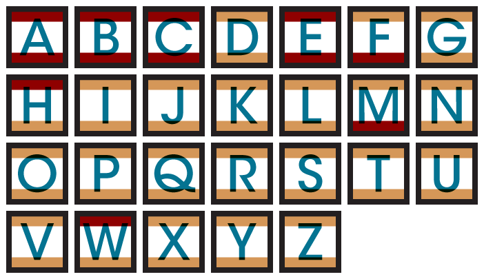
Following the letters in alphabetical order, red represents the first time a new shape is encountered. This shows that there are only a few basic shapes for the tops / bottoms of the letters.


Wouldn’t using the main part of the letter give more information? Yes, but it just looks like something went wrong. It’s also not as interesting, and I don’t want to just…spell it out for people.
The biggest blob gave me enough real estate to house a smaller version of the entire diagram inside of it. There, I recreated the shape and relative size / position of the letters (no connectors, shared diphthongs, or recursion information). I did actually plan this when laying everything out, which required a little guesswork.
Here is what the key buttons look like. They’re relatively small compared to the overall piece and were done by airbrushing little wood circles. There are magnets on the back, which allows the buttons to be rotated and the whole piece to be displayed horizontally.

All the thinking I did myself, but something like this takes a whole bunch of people to make it real. This video shows the second day of printing.
But of course all of that just got me to the point where I had the image printed on a giant piece of fabric, so I made the key buttons…

..and stitched some buttonholes and a little border…

…and finally it was ready to go on the wall.
