fbpx

Author: adam

  • hail album art

    hail album art

    The HAIL logo represents the 5 movements of the piece and their different meters, going from 4 to 8 (back to 4). I originally started making ‘real life’ versions of the logo because it’s just fun, but during the course of the Kickstarter campaign for this project, I’ve been doing a different version every day. I’ve tried to use these as promotional content that’s original.

    If you’re interested in how many of these were made, there are short video clips on my YouTube playlist for HAIL.

  • oldfield: return to ommadawn

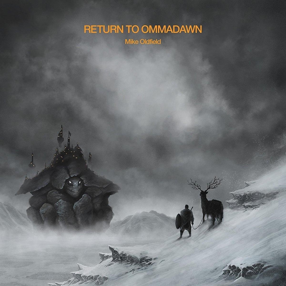
    oldfield: return to ommadawn

    I can’t imagine wanting to stop listening to this over and over again any time soon. If you’re new to Mike Oldfield, this is an ideal gateway album. That needs to be stated, because just picking up one album at random may not turn you into a fan. It also wouldn’t be representative of his work. Return to Ommadawn is representative of everything MO has ever done.

    He’s done his fair share of self-referencing in the past, but this album takes it one step further. There are allusions to the raging leads from Guitars, mysterious vocals from Tubular Bells 2, deafening crescendos from Songs of Distant Earth, lush chords from The Wind Chimes, and a dash of humor from Amarok. RTO slyly slips in to the best parts of his best albums while remaining completely original.

    The form is definitely his older style, something I’ve been waiting on for years. What you get is two LP side-sized tracks mostly of instruments played by the man himself. Many passages have only two instruments at a time, giving the album an intimate feel. This doesn’t take away from the fact that the music at several points sounds like the guy on the cover vanquishing that turtle-city thing in a battle of the ages.

    summary

    ★★★★★ It would be difficult not to like this album. Impossible, I imagine, for those who are already fans. Anyone who appreciates a timeless, complex musical journey that reveals more secrets at every listening, this is the album for you.

  • what to do with useless information?

    During an attempt to get Home DepLowe’s to repair the lawnmower from which I violently extracted the pull string, I experienced a taste of the unusual way humans and our digital overlords have chosen to use computing. The mower was purchased over a year ago, so, no, I did not have a receipt. Somehow knowing my dad’s phone number and the month (just the month, not the year) it was bought, the clerk was able to pin down an invoice number which would later be used thus:

    An actual human will go through our microfiche archives to determine whether or not you signed up for the Extended Advantage plan, which will allow me to refer you to one of our certified technicians.

    IMAG0243She really said those words. Sinking into moderate despair at the thought that anything could ever be run like this, and that more than likely actual governments are probably being run in more insane ways, I was pretty resigned at this point. I offered the digital image pictured here, asking if it helped. This was the reply:

    That’s good information to have, but it doesn’t help.

    From this point on, I pretty much zoned out, as 103% of my mental energy was directed at the philosophy behind that statement. I would disagree and say that on the contrary, non-helpful information is by definition not good information. Useless information is, in many circumstances, equivalent to misinformation or even a total absence of information. How could it possibly be good, in any scenario, to have information that doesn’t help you at all? Information’s quality  is directly related to its usefulness.

    By now, I had wandered off to aisle 73 or whatever and found myself in front of lawnmower pull string thingies for $4. I got one, went home, and in my DIY fervor, ripped open the plastic bag it came in only to find that the instructions I would surely need were printed on the bag, the most important part rent illegibly in twain. I felt a little solace in the fact that had I had the information on how to proceed, it would have been good, because it would have helped me. (Although, what would have really helped was READ THIS BEFORE NOT READING AND SUBSEQUENTLY DESTROYING being printed on the bag.)

    Following my application of forensic typography, I gathered that all the instructions told me to do was to make the broken thing not broken any more. This was when I first realized that all the package contained was a piece of rope and a handle  which would be impossible to attach to it: a parlor puzzle with tautological instructions.

    In the end, I fixed the mower in about 20 minutes, only a wrench and a screwdriver, not ninth-degree microfiche, involved. The moral of the story: if your lawn mower starter cord breaks, it’s not that hard to fix; this is good information because it is helpful.

  • current definition of art

    current definition of art

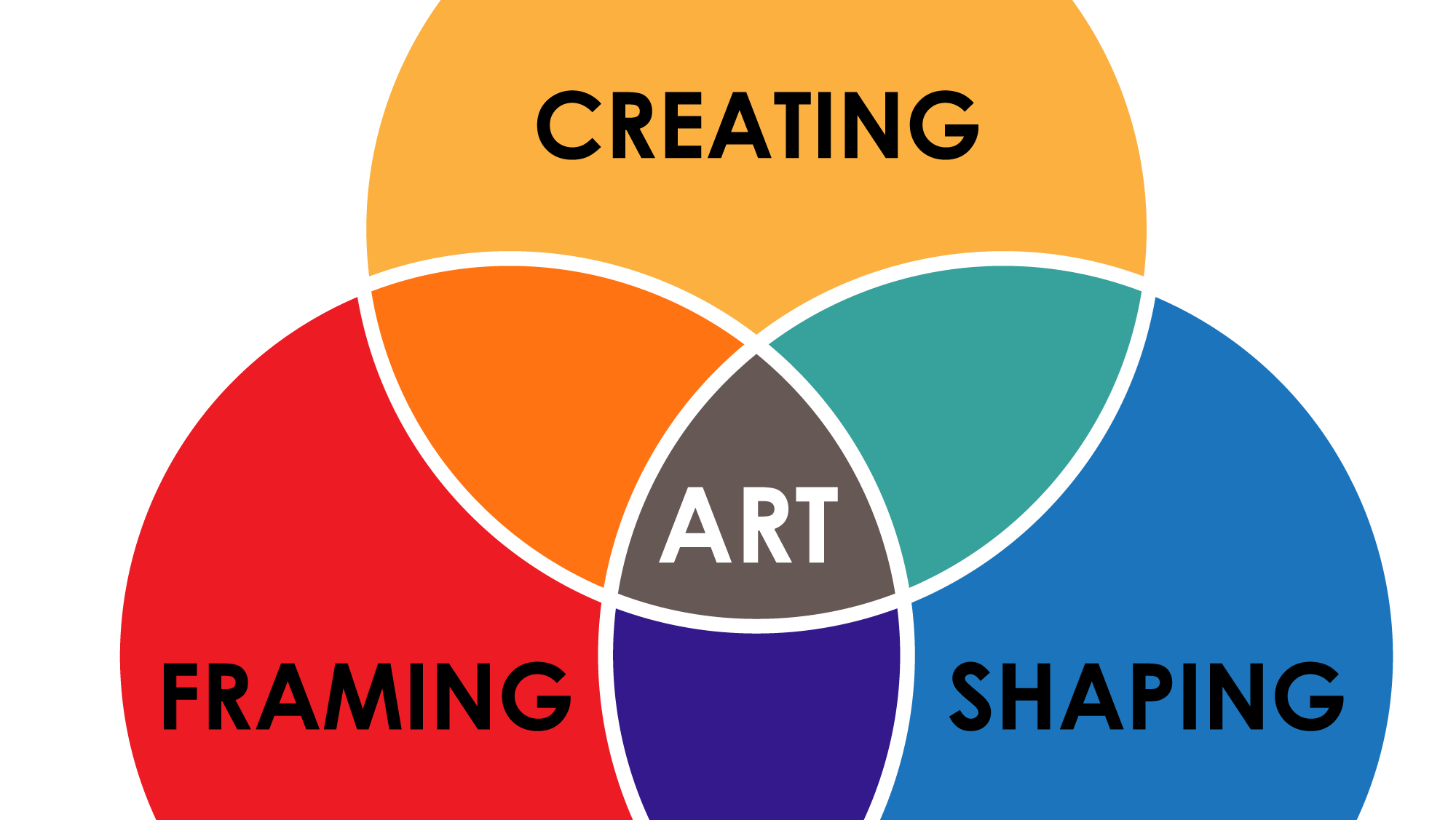
    components of an artwork

    A work of art has been fully realized when an artist actively participates in the actions of creating, shaping, and framing. When only one or two actions have been done, this only means that the artwork is not as fully realized as it could be.

    creating

    Since ideas can exist independently of things, there are no physical properties associated with this action. Creating an artwork could be anywhere from having an inclination to make a particular thing to a deep meaning behind something.

    shaping

    Shaping is the rearrangement of raw materials in order to trade one system of organization for another.

    framing

    The spatial and temporal boundaries which contain the work establish a frame for an artwork’s beginning and ending in space-time. The simplest form of framing is a change in perspective.

    aesthetics

    An assumption I make when using proportions in placement, repetition, size, and so on is that mathematical  relationships (such as the golden ratio) can be detected at a subconscious level and higher, and in this way are interesting to the viewer.

    role of appropriation

    When one artist uses another artist’s art, the former has had an active part in at least creating and shaping, and includes framing if the entire artwork was used. Examples of other people’s art (OPA) include photographing an uncited source, use of a font the artist did not create, and collage. My work seeks to be appropriation-free in order to maximize originality in the creative phase of art making.

  • cheap vs cheap as hell

    sorry but I think the only people who will get this are late gen-x parents

    cheap

    cheap as hell


  • hauschka: abandoned city

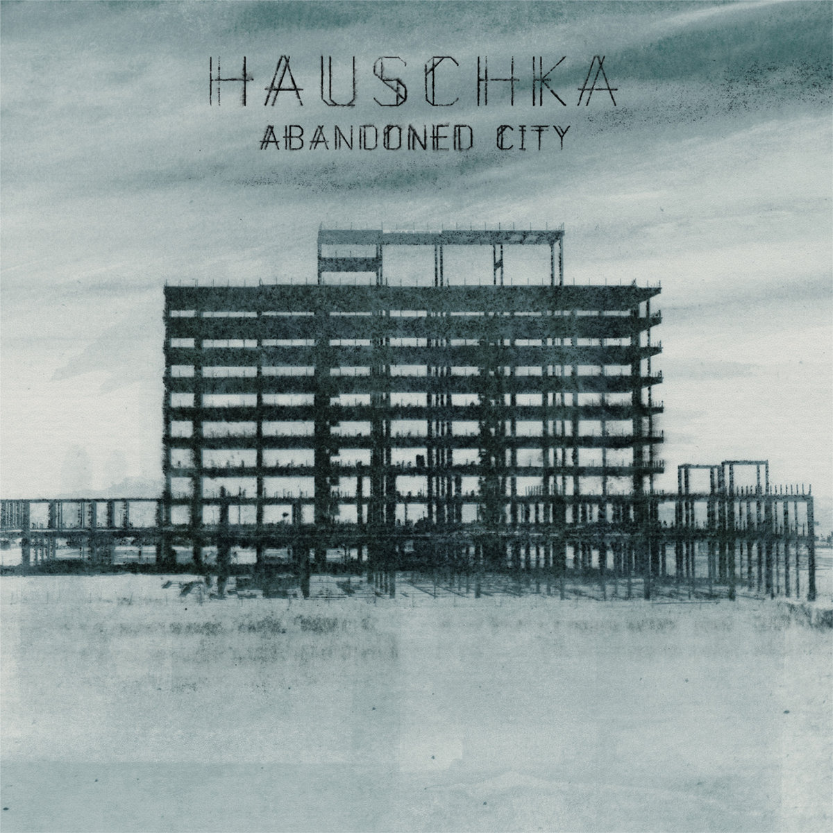
    hauschka: abandoned city

    Google Play sez, at the time of this typing, that I have listened to this entire album 17 times in the few days I have known about it (my thought is that it missed about 20 other listenings but who knows). Obviously, I am a fan. This is what I call music! Of course I was reeled in by the title and at first, I wondered how it would compare to Harold Budd’s Abandoned Cities. Here is the comparison: Budd’s generation is still reacting to the horrors of war, whereas Bertelmann’s generation looks past another possible global conundrum to a time when we will pick up the pieces of a busted piano within a deep forest and bang out a remembrance of now. The sounds of over-stretched metal cables in the second track put the listener in mind of an existence teetering on the edge of ruin. But, since it makes an awesome musical sound, it’s kind of okay that the world has ended. I do think it’s true that the children of the baby boomers have accepted that it’s all going to end, but luckily we’ll be there along with Tyler Durden and Katniss Everdeen and the dad from Jericho to rebuild it all. This album is the soundtrack to that: to rebuilding a future disaster.

    Tracks 3 and 4 of our musical journey through the wasteland bring us face to face with Battles and Victoire, respectively. By the time they’ve decided to join our party, we realize in track 5 that Torley teleported in without us noticing. Next, Darren Korb leads us forward in what is probably a terminal march. And then we find it: the busted piano WADF, being played by Ilya Beshevli.

    The 8th track may be my favorite. It’s hard for me to tell what’s prepared piano and what’s been processed, and I don’t care at all which is nice. It’s one of those short pieces that you can listen to a zillion times or just once followed by a lot of silence, because either way it will be in your head. The album ends as wonderfully as it begins, and with a sense of having reached a destination (it was your childhood home, which has been destroyed but you can set up camp there and put on an LP of this album).

    summary

    ★★★★★ The album is full of complex new sounds and memorable motives. Clocking in at 9 tracks, there is more than enough musical variety for an all-day listen. This is now one of my favorite albums of all time. And for the record, all references are meant to be complimentary.

  • sphere of fifths

    sphere of fifths

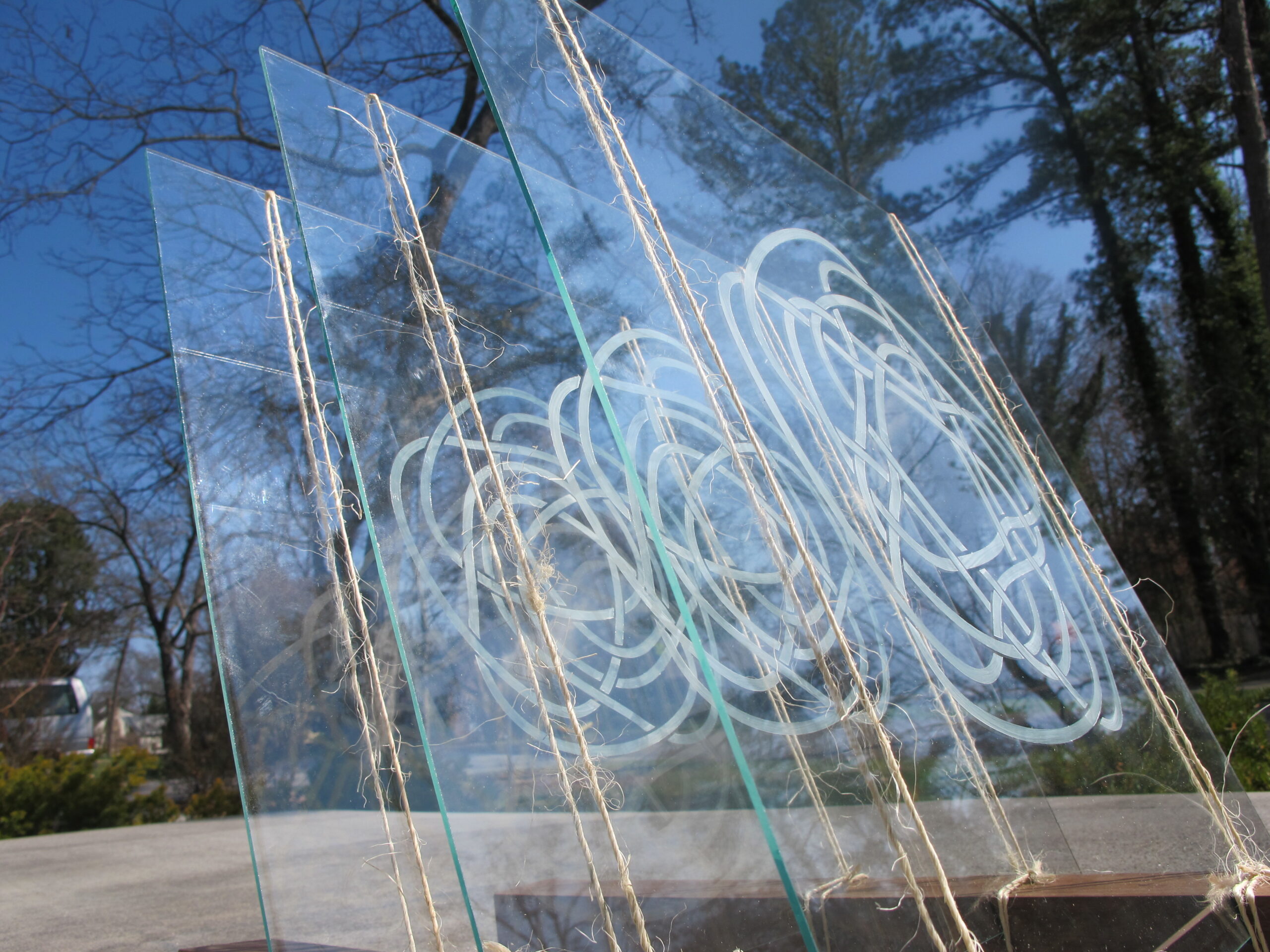
    The circle of fifths is a music theory model several hundred years old which describes the relationships between diatonic scales. It can be seen as an illustration of infinite chord progressions. Sphere of Fifths uses the idea of infinite knots to represent musical cycles, and uses pentagonal knot designs of varying complexity to bring the music theory model into 3 dimensions. When the light source is changed to different angles, shadows from the opaque parts of the glass combine in complex shadows; the viewer of the piece gets to decide on some of its content by taking this into consideration.

    The piece appears to be held together tenuously, the same way a motive in a good piece of music will hold everything together without having to overshadow things. The wood and strings are reminiscent of orchestra instruments. The knots themselves are similarly suggestive, but not directly representative of a circle of fifths diagram.

    This piece was donated to the KJDS‘s 2014 fundraising event.

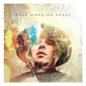
  • beck: morning phase

    beck: morning phase

    comments, track by track

    First off, my second favorite track is  the 39 second ‘intro’ track Cycle. What can I say; I got pretty pumped up (during all of those 39 seconds) about where this was going. Now that I’ve listened to the album several times, it’s hard to say why it’s even there. Just to tease us? Apparently. But, tease accepted.

    The album actually takes a step back from all the bustle of flowing ambience when Morning busts in at a raging ♩=40. Now, I’ve always said that if I needed to kill myself I’d for sure do it while listening to Shostakovitch’s Prelude and Fugue No. 16 from op. 87. In this scenario, when I’ve muscled past rock bottom and woken up to find that I’ve failed even at suicide, Morning would be an acceptable wake-up tune.

    Heart is a Drum centers around a repetitive little guitar block which I imagine as the crumbs left over from a Juana Molina banquet. It moves on to some nice and ghostly guitar / vocal etherea.

    Next we have Say Goodbye, which is clearly Suzanne Vega posing as Beck. I’m pretty certain that if I listen to number 13 on Songs in Red and Gray, after about 9 minutes, I’ll get to this hidden track. Rhythms, harmonies, and lyrics are decidedly Vegan, and as such are great.

    Mandolins. Nobody writes a sad song with mandolins in it. So, Blue Moon gives the general happiness exuded by that tiny little double-stringed gem an interesting twist (and I choose my words carefully here because it’s not some not-so-clever, ironic juxtaposition – see also any indie band using a glockenspiel) by inviting it to answer and play along to vocals bordering on melancholy. (And I swear the ending was written by Badly Drawn Boy.)

    By track 6, we’re back to pre-Morning soundtrack possibilities. Warning: Unforgiven should not be consumed with alcoholic beverages.

    It’s worth the trudge through Unforgiven to arrive at Wave. This seems like central idea of the album. At times, Beck channels Brendan Perry and obviously that’s okay. Now we can see that Cycle was actually a setup for Wave. The haunting nature of this piece is emphasized by its brevity. That’s why I give in to the temptation to listen to this one on repeat.

    Don’t Let it Go will snap you back into your seat without being too abrupt. What I’m really wanting to not let go of is the previous song, but then come the low strings as a welcome surprise.

    The album could have done without Blackbird Chain. Maybe I just don’t get it, but Don’t let it Go brought me to the same place as the end of the next track. They seem almost like looking at the same song from 2 different angles.

    Again, Phase reminds me what we’re listening to here. It’s another ambient intermezzo which turns things down a notch for the Simon & Garfunkel / Elliot Smith-seasoned Turn Away. When the the strings come in full force (unfortunately again toward the end), they are joined by the ghostly vocals and you realize that there is a new sound on this album. It’s a good sound.

    Country Down…could have done without this one. Someone tell me why I should like this. Disposable at best. I only allow CDs on my shelf if I would be happy being stranded on an island with them. This track will cancel its reservation there. I’m only being this critical because I like the rest of the album. Will listen again before writing the next sentence. Nope still don’t like it. Harmoni-come on.

    Back to reality with Waking Light. Second longest track on the album, but I was ready for several more minutes. This last one did make me want to make sure I had the repeat album button on.

    summary

    ★★★★ right off the bat. Good album. Loads of subtle parts, not great for listening to without paying attention. Minus ★ for Country Down until I ‘get it.’ Otherwise best when listened to straight through.

  • illumination 2014

    illumination 2014

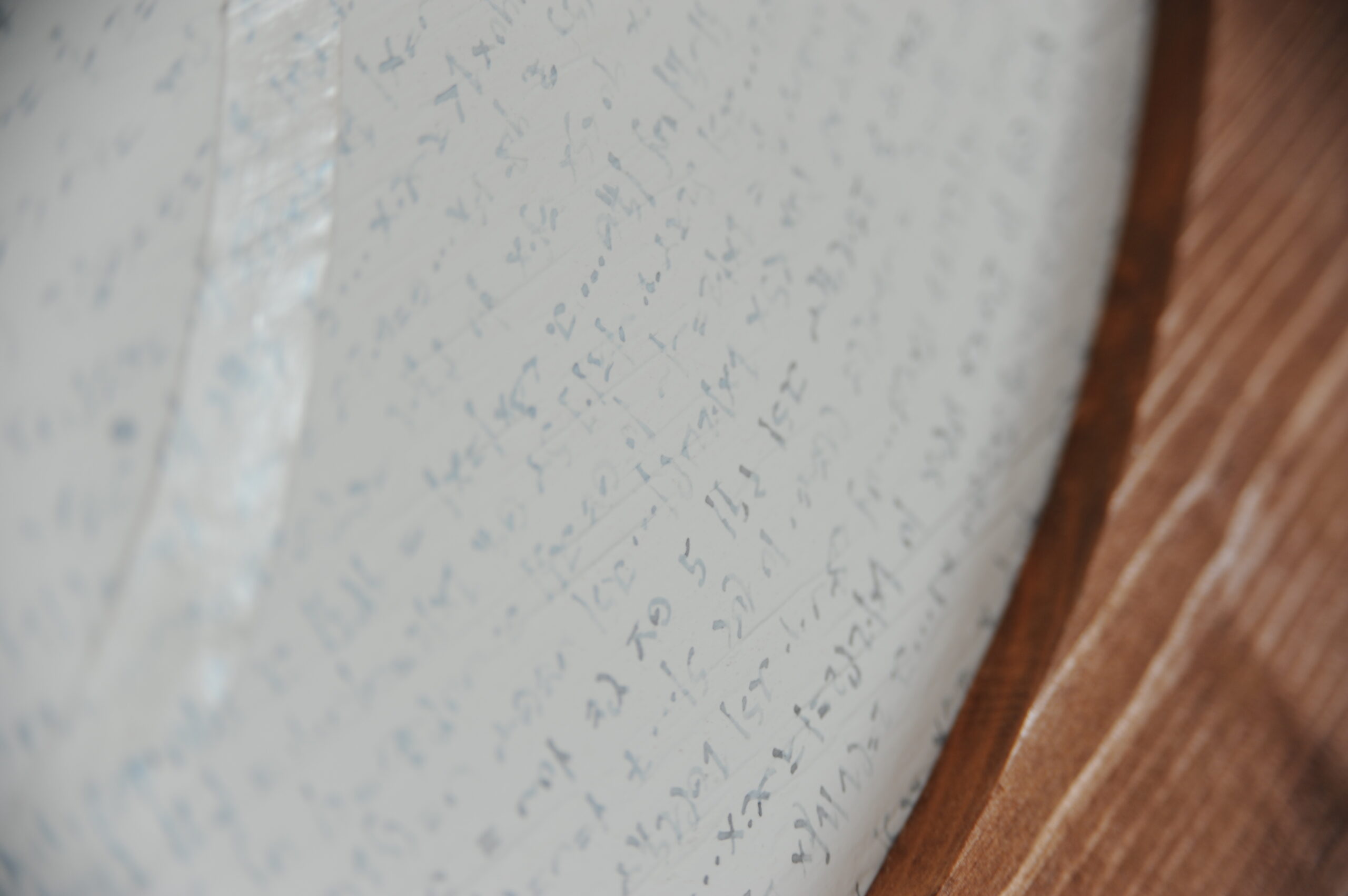
    This piece was made for a show at the Fountain City Art Center. It was my first big knot design. The knot itself was cut out of paper, fixed to the support, and painted. The writing starts in the middle and spirals outward.

    The circle became my journal while I was working on this.

  • proof

    proof

    background

    Students who graduated around the millennium from Carson-Newman College were invited to submit recent works for a show to coincide with the university’s 2013 homecoming. The purpose of writing so much about this piece is mainly to explain my artwork to the other people in the show, since it was done partly for them.

    A geode is a regular-ol’ looking rock that, when cracked open, reveals a secret world of gemstone. If someone handed you a geode, you would have to take it on faith that in the center were amethysts. It would not be until you destroyed the rock-ness (the smooth, round, appearance of something that looks uniformly rocky) of the geode that you discovered its real nature.

    Years after my senior show in 1999, I decided that 1) instead of trying to maintain the pristine nature of several of the pieces and 2) as a way of ‘moving on’ since they physically took up a lot of room and actually got in the way of working on other stuff, I would burn them and save the cremains for a future project.

    The development of my optophonetic alphabet has been an ongoing project since high school, and as such has become a part of my artwork. It, along with keeping a journal, was something I was always working on through college.

    Proof that I was Where I Said I was at the Time I was There
    wood, paper, paint, cremains of 1999 senior show
    2013

    process

    The cremains were the material I had first, so they were good to go.

    I had the general idea for the form in my head, but I couldn’t work out if it were possible to really exist when I sat down to measure materials. I tried sketching out the form, but I wanted to be sure it would really occupy the space I wanted it to. So, I used SketchUp to create a model on the computer. As I was creating this model, I decided that 21 inches in any direction was a good size; each cube would be a 1-inch cube, for a total of 2321 cubes.

    In order to use wood for the basic structure, I planed down 2 x 12s to get precise 1-inch pieces of wood to work with. Thanks to my dad for this, because he suffered through running boards through the planer for 2 days with me. After that, I built the structure according to the model.

    not angry, just concerned about time

    With the cubes stacked the way they are, only 1326 faces of these cubes are visible to the outside. I used this number as the number of characters I would use for the written message which would appear on the cubes. The form as a whole is based around a cube itself, and so characters on the faces could be read from six different ways. To easily type my message, I needed a font, which I created using FontForge.

    I also needed a 2-d way of plotting where the characters would go in 3 dimensions, for which I used Excel (which I like to refer to as Microsoft Grid, since that is often how it it used). After writing a message, I used Inkscape to create .DXF files for use with my paper cutter. As the letters were cut out, I glued them in the right place on the structure and painted it with many, many coats of primer.

    meaning

    The message written all over this piece has a plain meaning. I wrote about being in school with the other people in the show, about how lucky I was to be around them, and the sense of healthy competition which pushed us all to take things to the next level.

    me actually putting some last minute paint on

    One thing I still like imagining is the pieces in the gallery at night, with no one there, but the presence of the artworks being there, sort of representing each of us. For me, the whole show was about creating a monument to our time at school together.

    time lapse rotation, so you can see it from most angles

  • recursive antecedent quick response code experiment

    recursive antecedent quick response code experiment

    What, you didn’t think it would work…?

    If it’s not obvious, this is a time lapse video of me constructing a QR code which links to a video of me constructing a QR code which links to a video of me constructing a QR code which links to a video of… you get the idea.

    This gallery contains full and detail views of a QR code pointing to this site. This was one of my first successful QR code paintings. After getting the code, I used a Sharpie to draw the dark squares.

    Take a picture of the screen at the end of the video to see it in action. See you in a minute.

    resources

    To photograph, I used a Nikon D200 and a timer trigger. The photos were then dumped in Windows Live Movie Maker and the video was uploaded to Vimeo.

  • the four laws

    1. Remember the Four Laws.
    2. Remember the Order of the Four Laws.
    3. This is the Third Law.
    4. Never forget the Four Laws.

    Please note that this list does not include the apocryphal Fifth Law, which states, “There are only Four Laws.”

  • martian / alien painting

    martian / alien painting

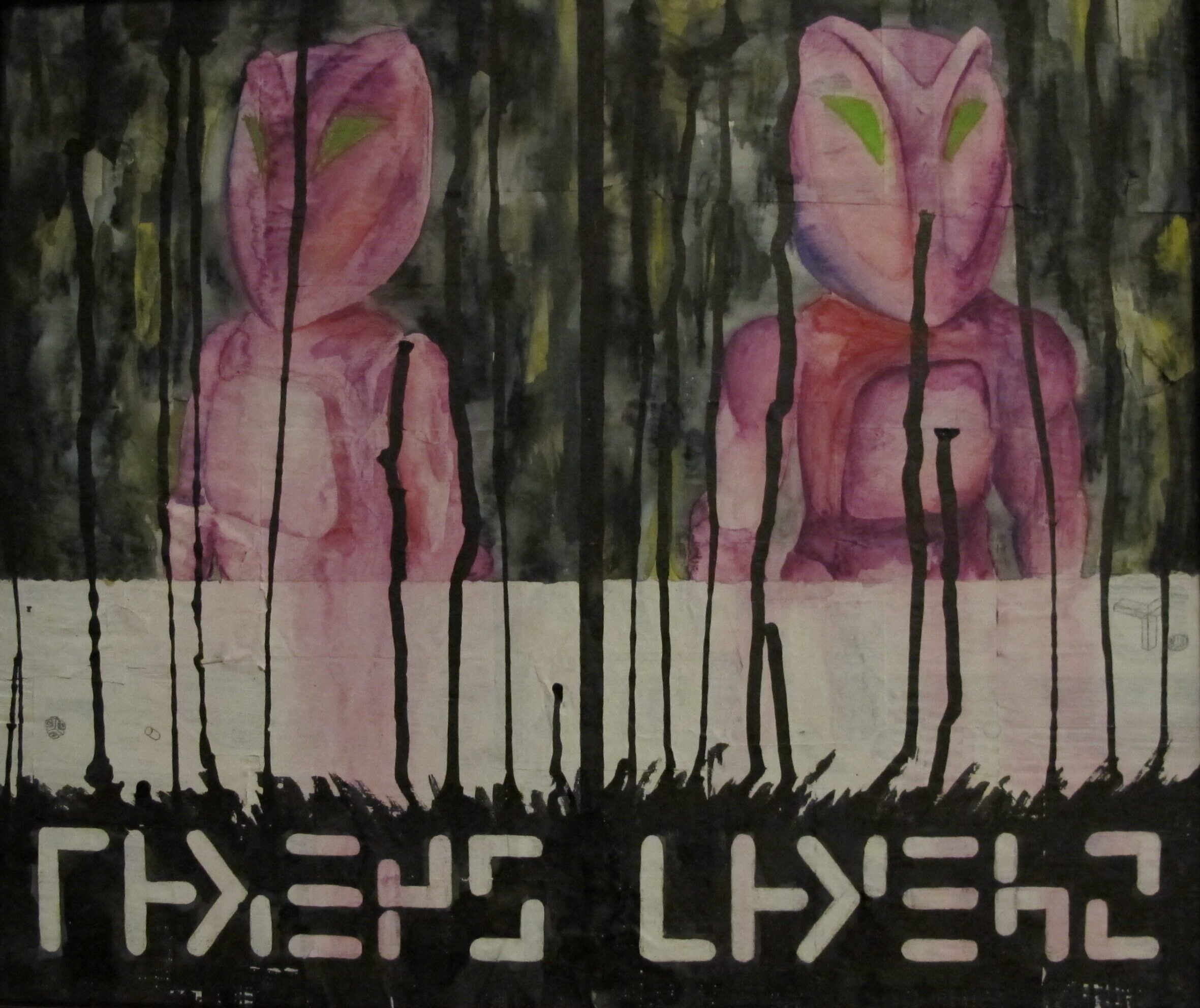
    Normal 80s kids had Legos. My brother and I had Construx. I had the Space Series stuff that glowed in the dark, and Jerry had the purple Alien stuff. It didn’t seem odd at the time, but since he had two of these figures, he named one Alien and the other Martian. This painting serves as a monument to the days before our minds were clouded with things such as sub-classes and parent categories.

    The text(?) below the portraits are from 2 different decals (and yes, I know that one is just the other upside-down) from the Battlestrike set. I like to believe one reads martian and the other alien.

    The painting was done on a board covered in old Construx instructions, which peek through here and there. Other media used were ink, tempera, and watercolor.

  • time-based HSB color values

    My interest in time-based color values came from reading about the concept of chromo°. Picking a point from the HSB color model proved more complicated than I originally thought. Ben Bryant helped me do the hard math parts to figure this one out, so special thanks to him.

    See the Pen time-based HSB by adam rowe (@barabadam) on CodePen.

    Above is a working JavaScript sample of an equation to obtain color values from the HSB color model based on time units.
    Below is the equation in general terms. View this page’s source for the exact code, which also converts the colors to hexadecimal values.

    (round(max(min(abs(767*((($degree+0) % 360)-180)/180)-256,255),0),0))*256*256+
    (round(max(min(abs(767*((($degree+120) % 360)-180)/180)-256,255),0),0))*256+
    round(max(min(abs(767*((($degree+240) % 360)-180)/180)-256,255),0),0),6)

    $degree is the percentage of time unit (divided by half of the total units to offset the difference [by 180°] between chromo° angles and HSB values).

  • my name

    my name

    Below are real life implementations of a logotype of my first name. The first version of this was created when I was in middle school, c.1990. After taking art more seriously, or at least doing more art, I have been in search of a symbol or mark which represents me. I returned to a version of the original, adding 2 shades of red (to emphasize the chromatic aspect of אָדָם). The diagram here shows the symbol on a 60° axonometric grid, which reveals some exact proportions, namely that the first 3 letters together have the same area as the last letter and that the entire area is made up of 10 equilateral triangles (shown in light blue).

  • advance backward

    simulated image of adam being amazed at the capacity of the new zip disks
    simulated image of adam being amazed at the capacity of the new zip disks

    In 1998, I bought a Diamond Rio for $200. My life changed. I could take almost half an hour of high-quality, digital music with me anywhere. I had so much fun creating the ultimate 30-minute playlist every morning. I could walk to class or do shopping listening to music. After a few weeks, I sewed the device and my headphones into my jacket, so I would always have my personal soundtrack. Even though I couldn’t fit all of [amazon_link id=”B000006MTX” target=”_blank” ]Shostakovich’s 24 preludes and fugues[/amazon_link] on my Rio, I was patient. I mean, do I really need to carry around more than 30 minutes of audio?

    After a while of this kind of behavior, I got over it.

    In 2001, I set up my computer to serve an text file to my website, so when I had my computer on, the text adam is currently sitting at his computer would appear on the footer of every page.

    And then I realized no one cared about status updates.

    In 2005, I bought a Treo 650. I could now synchronize my iCal with my phone, work on Excel files wherever I wanted, and best of all, send rich text messages, with photos or video. I sent messages to everyone I could, and photos and videos to people who could receive them.

    And then it just got old.

    Wouldn’t you know it, but 3 things I really hate are:

    1. people constantly plugged in to headphones
    2. people constantly updating their status
    3. people constantly sending text messages

    I feel justified that I binged when I did, because I was trying to get a handle on how these new things might affect my life. They were novel. So I binged, reflected, and backed off.

    Notice the common term in my list above: constantly. Do people not realize that all these things are incredibly narcissistic? I never before wanted to smack someone upside the head because they weren’t listening to music in public. Do people hate silence? Do people just hate one another more now than they used to? They are certainly now more enabled to exhibit behavior that leads me to believe so.

    (For this post I’m leaving out the blog I made in 1995 and got over, since I’m finally in to blogging. And, queue sad trombone.)

  • roman alphabet observation

    I wanted to call this my roman type theory, but it’s just more of an observation of an interesting pattern. Maybe after you read this, you’ll look at the alphabet differently, especially if you’re looking at the alphabet with something obstructing your view of most of it….

    What I mean here by the roman alphabet is the characters used to represent the English language to English readers. If you are not familiar with this alphabet…how did you read this?

    it is easiest to illustrate this observation step by step:

    consider only the top and bottom portions of the alphabet. write out the alphabet in order with these portions highlighted (brown), using a different color (red) for the 1st instance of each distinct top or bottom.

    remove each letter not containing the 1st instance of a top or bottom

    remove the middles of the letters and subsequent instances of tops and bottoms.

    condense the remaining tops and bottoms by shifting leftward

    this is where the pattern becomes more obvious. there are only 6 distinct tops and bottoms in the roman alphabet. they are described below in the illustration as:

    • single point
    • line / curve
    • curve
    • line
    • double point
    • triple point

    the order in which these 6 tops and bottoms appear is illustrated below (and could also be 1/5 2 3 4 5/1 6, depending on how you look at it).

    in conclusion, not only are there only 6 distinct tops and bottoms, but the order in which they appear creates this interesting pattern. these numbers or shapes could be used to represent the alphabet as a whole.

  • the dark path of Boggle™

    boggle cube spelling out the title of this postHere is some advice. Scenario: you’re playing Boggle™ and you’re able to come up with ‘bird.’ Congratulations. You must have read a lot of Highlights as a kid. But wait, what’s that? A suffix…for a noun. ‘-er.’ So now you have ‘birder.’ You have now begun your journey down the dark path of Boggle™, and your gaming partners give you that half-lidded Jon stare from Garfield.

    garfield: july 22, 1999
    look at those eyes

    They mentally consider any number of arguable points perhaps including the following:

    1. A falcon is birder than a sparrow.
    2. An emperor penguin is birder than a non-emperor penguin.
    3. An ostrich is birder than a kiwi.

    …and so on. But you were thinking of ‘birder’ as in ‘bird-watcher.’ You are now requested to give account for the difference between ‘birder’ and ‘ornithologist.’ The answer?
    Money / education.
    Consider:

    1. farmer vs agriculturalist
    2. singer vs vocalist
    3. painter vs artist

    Basically, ‘-er’ means amateur and ‘-ist’ means professional. However, you can’t just slap either ending on just any occupational description. After all, how far would you trust someone who claimed to be a gynecologer? Armed with the knowledge that the occupations described by the lowbrow / -er words can be carried out by anyone, what noun can not be a verb which can then be turned back into a noun? Floor – floorer, water – waterer, chronicle – chronicler… Okay, there are a few, like ‘cat,’ but you just add another ‘-er’ and you’ve got ‘caterer,’ the less professional version of group-gastronomist.
    However, what is a racist, but one who competitively drives automobiles? Sure, there might be multiple meanings for that word, but that’s what linguists are for. (Or, depending on your resources, dictionariers.)
    The point here? Don’t be tempted by the the dark path of Boggle™. Once you open the game up to this kind of insanity, your partners will trust you less. In other words, your fellow Bogglists will view you as a mere speller, a worder, an amateur…er.

  • cube: the seven-sided box

    cube: the seven-sided box

    the poem (or whatever a non-writer like me is allowed to call a bunch of words such as this) was written in 1999 in response to heavy rainfall in bright sunlight. the music was written between 1999-2002. each movements is a side of the box.

    	the sun was shining
    	but there were clouds
    	it came down
    	and he came down
    	I said, 'hey, man, what am I supposed to do with this seven-sided box?'
    	I didn't notice what I was saying at first
    	so he didn't really tell me
    	or maybe I didn't understand
    	he wasn't a man, though
    	but he didn't really tell me
    	so I'm not really sure what the deal is with the seven-sided box
    	he said I could use it with friends
    	he said if I listened
    	he said this is the seven-sided box
    'well, I can see that'
    	the clouds passed
    	and he said you got any friends?
    	I just wanted to know what it did
    'what's it for?'
    	listen
    	so I said I know people
    	but he said, come on, everybody's got friends
    'my, what big eyes you have'
    	that's not the way it works though
    	clouds and sunlight
    	not everybody
    	he said you must be a friend to somebody
    	I just wanted to know
    	I tried to listen
    	when it came down, sounds could be heard
    	some things were clear
    	but what was the deal with the seven-sided box?
    	there's always a side you can't see, isn't there?
    	what is it for?
    	huge eyes, I tell you
    	he said he had all day
    'of course I got friends'
    	that's a strange number of sides for a box to have
    	he wasn't from around here
    	I got a few friends, anyway
    	he said he was
    'you'll be here for quite a while, won't you?'
    	I gotta go get my friends
    	listen
    	he said there's always a side you can't see
    	no, but really, I have good friends
    	they listen
    	not as sunny, but lighter
    	and that's not really the way it works, but I think he knew that
    	he said here, learn the seven-sided box
    	not a man
    	he said I could already hear it
    	the seven-sided box
    'what is it for?'
    	listen with your friends
    	more light
    	listen to your friends
    	more light
    	it's harder to make a decision when you can't see every side, but I doubt that was the point
    	light
    	listen lighter
    	everybody knows people
    	he said you already kind of listen
    	the important part really is wanting to listen
    	out of the sky, he didn't just walk up to me
    	or through the sky
    	or from the sky
    	the guy was tall

    recording info

    This piece was scored with Sibelius and rendered using FL Studio Mobile.

  • bulb: legend two

    bulb: legend two

    legend two is orchestrated for the following 18 instruments:

    1. recorder
    2. flute
    3. oboe
    4. bassoon
    5. clarinet
    6. horn
    7. guitar (nylon strings)
    8. harp
    9. harpsichord
    10. piano
    11. hammond organ
    12. xylophone
    13. vibraphone
    14. marimba
    15. tubular bells
    16. taiko drum (or any low, pitched drum)
    17. timpani
    18. contrabass

    I-IV, VIII-XIII, XV-XVI, and XIX-XX are connected, with no pause in between movements.

  • hail

    hail

    HAIL is a quartet for double bass. The five movements make up a cycle of meters, beginning with eight and subsequently losing an eighth note: seven, six, five, and ending up at four (or back at eight, depending on how you look at it).

    The first movement has all instruments playing arco. One bass in each subsequent movement switches to pizzicato for the duration of the work. The basses are arranged in an arc around the listener, and the technique changes go from the first to the fourth bassist – left to right.

    When hail stones are formed, layers of ice build up on the original frozen water droplet while wind and heat carry the hailstones back up to their original elevation after beginning to fall. This process is mimicked by the technique and meter changes of the movements.

    The current demo on Soundcloud was made with Sibelius 7.5.

  • july: legend one

    july: legend one

    Musical accompaniment is now written for many visual formats. Most of these formats (opera, movies, video games) tell a story; the music serves as a backdrop for the story.

    The aim of the legend musical form (legend in the story-telling sense) is to re-invent this process: if music can be written as a supplementary element of an audio-visual story, why couldn’t the music be written first, leaving the story up to many possibilities?

    Legend One, titled ‘July,’ is the first of hopefully several implementations of this form. It is a large work for chamber orchestra (instruments shown in as tags on this page) in 26 movements and is about an hour and fifteen minutes long. It is what I think of as post-minimalist, with each movement featuring only a few instruments.

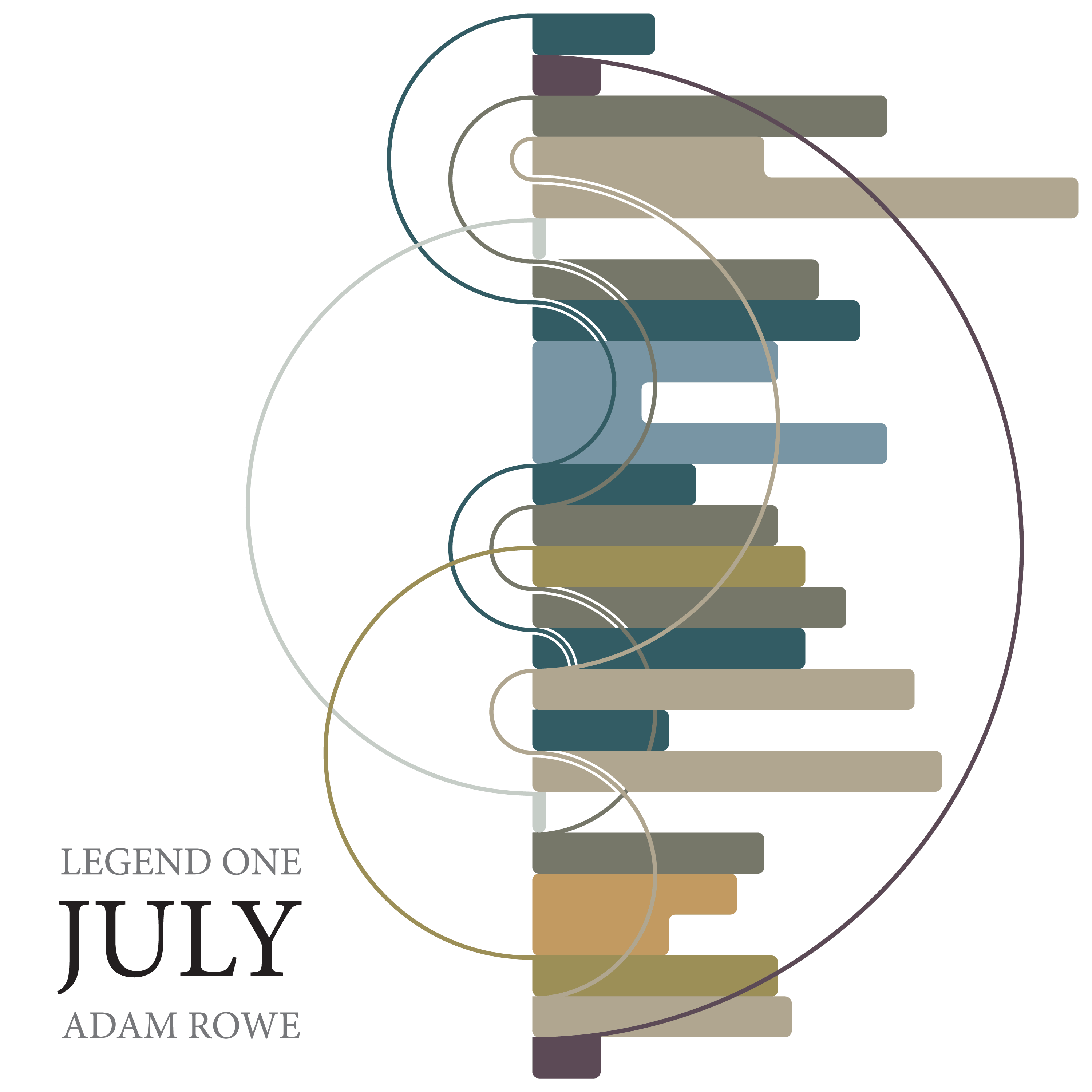
    The image is an illustration of the form of the piece in terms of theme.